November 26, 2017 saw the grand finale of the 71st season of Formula 1 racing. At the end of the Abu Dhabi Grand Prix, World Champion Lewis Hamilton had driven his points tally north to 363, decimating foe Sebastian Vettel who finished the year 46 points behind. The 22-Grand Prix season saw Mercedes win it’s fourth World Constructor’s Championship, with Ferrari and Red Bull Racing at second and third place respectively.
The drivers and their teams celebrated, experts analysed, and the fans consumed it all. Festivities done, another year of the world’s most expensive motorsport came to an end. And then, this video aired on all official F1 channels. And that video gave us this:

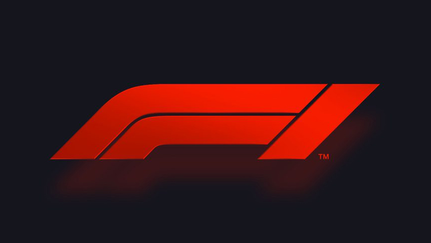
Wait. What? Yes, that’s the new logo for Formula 1.
It is flat, swoopy, and sports a modern-retro feel, similar to logos for ESPN, North Face, and Amazon’s show, The Grand Tour. The new logo, as creators Wieden+Kennedy London, Formula 1 officials and Liberty Media, the group that now owns Formula 1 say, also denotes two F1 cars turning in to a corner, or coming out of a corner, battling it out to cross the finish line. The logo is meant to make the viewer think of the shape of a Formula 1 car. And, the creators say that the new logo also had its fair say of fan participation, with 14,000 supporters from seven countries giving feedback.
Most importantly, according to W+K London’s Richard Turley, who headed the project, the new logo “has been designed to keep application in mind.” Especially for digital platforms.
It replaces the iconic “negative one” logo designed by British design agency Carter Wong that debuted in Formula 1 way back in 1987. As the agency’s website says,
Always one step ahead of the game, Bernie Ecclestone’s aim back then was to raise the standard of Formula One to the same level as the Olympics and the FIFA Football World Cup. We like to think our logo – which is still going strong today – helped achieve that success.

The overhaul of the logo was led by Ellie Norman, the first ever Formula 1 Director of Marketing, who claims the redesign is the first step to making the sport accessible for new fans once again.
When we talked to fans about what made Formula 1 amazing, what we heard was people loved the real, exhilarating, unpredictable and incomprehensibly fast elements of the sport. It was about racing. But many felt those days were behind us and that the sport has become almost impenetrable for fans, particularly new ones. It was clear we were going to need to address some fundamentals of our brand, if we were to realise our ambition to make Formula 1 a major entertainment player and claim our rights to be the global media brand we should be. What we say and do now is so important for our future, but it must always be driven by our fans. They come first.
That’s quite a task Liberty Media has set out for itself. The group that bought the ownership of Formula 1 in early 2017 for a cool $8bn, says a new television package is in the works, along with a revamped plan for social media and the web. We’ll see a lot of the changes by 25th March, 2018 for that’s when the next F1 season begins.
However, the new logo has also brought with it quite a lot of divided opinion, and it’s not just among the fans. FIA president Jon Todt said that the governing body approves of the new logo. “It’s up to the rights holders to introduce a new logo if they want to,” he said in Abu Dhabi. “People should be positive about change. The people at Liberty are very talented and have proven their qualities in other sports. I trust their judgment.”
Meanwhile, Abu Dhabi Grand Prix winner Valtteri Bottas asked, “What was wrong with the old one?”. Four-time World Champion Sebastian Vettel said, “I liked the old one better.” And current World Champion Lewis Hamilton didn’t disagree. “I think the one we had already was iconic,” he said. “Just imagine Ferrari or Mercedes changing their logos.”
Well, the jury is surely out on this one. What do you think? Tweet us @readytomelt or post on our Facebook page.


