Simplicity works. There’s no two ways about it.
And advertising that relies on crystal clear communication gets noticed. There’s no two ways about that either.
Especially when you’re driving, and really shouldn’t be looking away from the wheel for a long time.
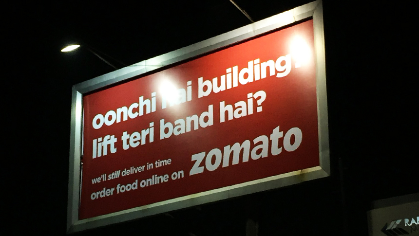
Which is why this tongue-in-cheek billboard for foodtech company Zomato’s food-delivery business works.
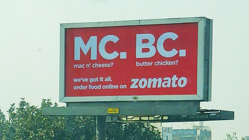
A little digging around on Twitter threw up more examples of a billboard campaign that’s live in Mumbai and Delhi.
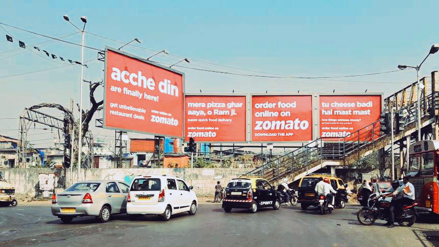
There are no images or graphics. Just a witty headline that will definitely make you want to read the following call-to-action message. All done in bold colours that make the ads stand out. The campaign might not win creative laurels, and it surely doesn’t break any new grounds. But it’s simple, and may just remain with you till the next time you decide to call-in rather than cook or dine-out. Kudos to the creatives who came up with this, and to Zomato for running this.
On a completely different note, why is “Zomato” presented in a typeface different from the one that’s seen on the app, on the website, and most “official” communication. It won’t really affect the next online order, but we’re just curious.
