Throughout the years, design has been a substantial part of brand marketing and brand identity. From logos, print ads, product design to digital and even television commercials, the visual representation of any brand is important to communicate a desired message. Graham Fink, Chief Creative Officer, Ogilvy, is the man behind some of the advertising world’s most celebrated images and campaigns including Coca-Cola, British Airways, Silk Cut, Benson & Hedges, Land Rover, etc. He won Ogilvy Asia’s very first Grand Prix at Cannes for Coca-Cola’s #CokeHands and admits that good design is all about simplicity. In an interview with Ritwika Gupta at Designyatra 2017, Graham talks about the role of design in relation to branding and the challenges of getting the design and marketing teams to work in partnership.
What, according to you, is the role of design in brand communication?
The role of design in brand communication is to be very clear and communicate. One of the problems with design is that it can get very confusing. For instance, I just came through a couple of airports, on my way here to Goa. The signage is not up to the mark and a lot of people got confused. So, that is not good design. Good design in advertising is about clarity and communication.
When it comes to a campaign’s development, what kind of design would make a clear statement, pulling the audience’s focus through meaning as well as aesthetic value?
One thing to understand is that every brand has a tone or voice and that needs to be reflected in the artwork. If you are working on a very serious subject, you got to be respectful with that in the design. If it is something a little more frivolous and fun, like a FMCG brand or sweets, or soft drinks, for instance, you can have a lot more fun with that. You should really enjoy the brand’s tone or voice and that will lead you to what you want to communicate with the design, colours and typography.
The “Coke Hands” campaign is the most awarded campaigns in Coca-Cola’s history. It’s a campaign which you had led and design played a crucial role – tell us more about it.
I had been in China for a couple of months and I went back to UK for some work. It happened to be the day that Steve Jobs died. So, the front pages of all the national newspapers carried that piece of news along with Apple Logo and someone had played around with the logo such that the bites in that apple became the silhouette of Steve jobs.
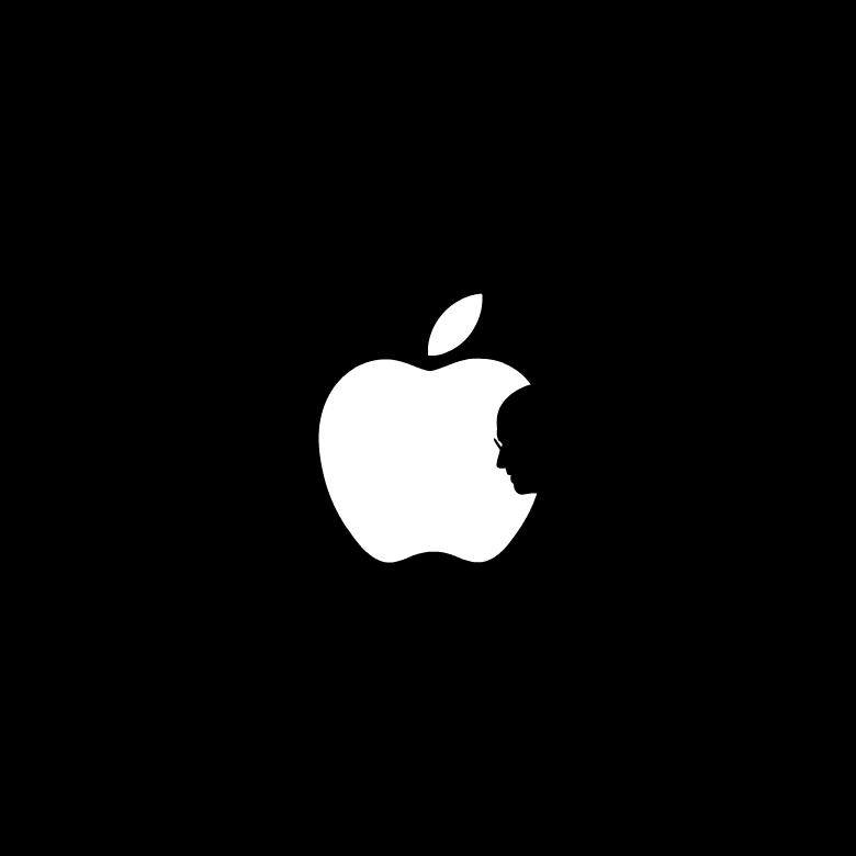
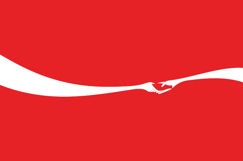
I thought that was a fantastic piece of design, a great piece of lateral thinking. Underneath the logo, it just said “designed by a Hong Kong student”. There was no name and it took us about 200 phone calls to find this person – Jonathan Mak, funny enough, “Mac” spelt with a ‘k’. I told him that I wanted to work with him on a project and a few months later, we had this brief from Coca-Cola – sharing a coke. It was a very simple brief. Jonathan sent a rough sketch of these two hands, a hand passing a bottle of coke to another depicted in the form of Coca-Cola’s iconic white ribbon. With a bit of finessing, he made it look very beautiful. The poster was designed as part of Coca-Cola’s global “Open Happiness” campaign. The campaign first launched in Shanghai but is making its way to countries around the world. The poster has won a Grand Prix in the ‘outdoor category’ at the Cannes Lions. But it is just a very simple piece of design and that is what great design in advertising is about. It is about taking away everything that is superfluous and just having the very essential elements.
How do think consumers are viewing designs, when it comes to brands?
A lot of my friends in the UK talk about the stuff that happen there and I keep thinking that is not how things are viewed in China. It is very different. The fact is that there are so many different cultures. If you look at Cannes, more and more people and clients are becoming aware of different cultures, ideas and creativity. That is how we would understand and respect each other’s creativity. It is about collaborating.
Run us through the entire process – does the marketing team get a brief first and what stage does the design team get involved?
A typical process would be a client coming to us and asking us to solve a particular problem. Then, a strategist or planner would be involved to work on a brief. After that, the brief comes to the creative teams. I often prefer if the creative teams are involved earlier. Unfortunately, these days, things are getting faster and faster. There is an amount of time to come up with the idea, the solution and then go back to the clients. Often, if there is a lot of money involved, a lot of research is expected. Post that, we go into the process of producing it. Whether it is an ad film, poster, pamphlet, brochure or any piece of design, this is the point when the craft takes over. And the craft is a huge part of it. The colours, the typeface, how it looks – you got to train the eyes. So, when someone looks at it, they know what to look at first, where to look second, where to look third and so on.

Is it challenging for the marketing & the design teams to collaborate? Their tools might be different but how do you ensure that both the teams are working together, towards a common goal?
Well, it is difficult to get the marketing and design teams to sometimes work together. Also, sometimes clients are so big and have many layers. So, the brief given by one layer of people is not necessarily what their boss thinks. And a lot of time is wasted. I wish sometimes you could get everybody on the same page together and you can talk directly to the key decision makers. But basically at the end of day, everyone has to understand the problem, the business problem – what is the real issue that you’re trying to solve. We should be in a boardroom, listening to and understanding their problems.
In the age of digital marketing, how do you see the role of design evolving to appeal to a digital savvy audience?
People talk about digital being cheaper than TV but there is a lot of discussion on these figures being made up. A lot of the clicks are not real human. I think the most important thing is the idea, always. AI (Artificial Intelligence) or VR (Virtual Reality) or social media are not ideas. You need an idea before you do anything else. Then, it is about working with specialists who can help you bring the idea to live. It has got to be that way. During a crisis, often the first place that people cut is the marketing budget. I do not think that is right. They should be looking at other costs because your presence out in the environment and culture is hugely important. If you are cutting your ad spends, you are not going to be that visible. There is a lot of stuff that needs to be looked at. Truth is the most important thing. To know what the brand really is, what it stands for and what the products are really like – if you are truthful in your advertising, it is much more engaging.
Lastly, what do you love most about being in advertising?
I love the energy, the people. I love being surrounded by a lot of different opinions and it is great to hear from a wide range of people. At the end of the day, however, someone has to make a decision. But just because I’m a chief creative officer, it does not mean that I am always right. No, I am definitely not always right.
